Pilots are one of the most weather-informed groups in the world. They must be, because a change in wind direction or a developing storm can make a mess of all their other careful planning. The aviation industry has recognized this, and they make many resources available for pilots, from continual broadcasts from airports that include the weather to online treasure troves of weather data.
One such gem that aspiring pilots should get to know is the AWC website. The Aviation Weather Center (found at aviationweather.gov) is part of the National Weather Service (NWS) and one of the National Centers for Environmental Prediction (NCEP) within the National Oceanic and Atmospheric Administration (NOAA). (Pilots do love their acronyms.) The AWC, which is based in Kansas City, Missouri, works to forecast hazardous weather conditions and make the most up-to-date and accurate weather information available for the aviation community.
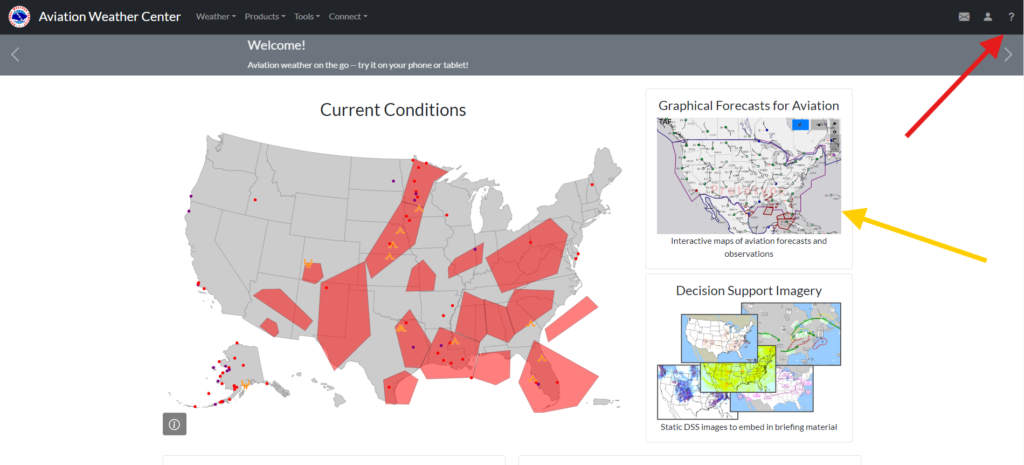
One of the most useful items you’ll find on their site is an interactive weather map called Graphical Forecasts for Aviation (GFA). You can reach it by clicking the GFA map section on their homepage (Figure 1, yellow arrow); it includes both observations, which are the current conditions, and forecasts, or the predictions of weather to come. It opens to a map of current observations. (If it seems intimidating, choose help—the question mark in the upper right corner [Figure 1, red arrow]—and check out the tutorial.)
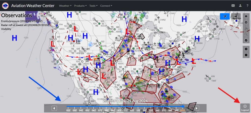
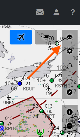
By using the arrows one either side or sliding the blue bar at the bottom to the left (Figure 2, blue arrow), you can see these observations up to 18 hours in the past. You can also zoom in and out to get just the portions of the map that concern your flight.
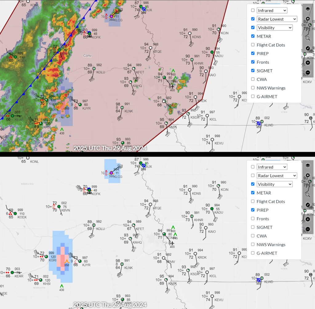
This map provides an amazing amount of data. Clicking on the circled i in the lower right corner (Figure 2, red arrow) will bring up the legend. The sheer number of options available in the legend gives you a hint to the amount of information available.
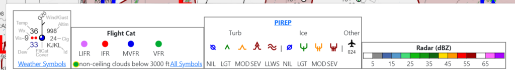
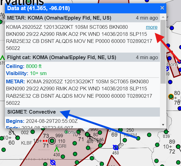
SIGMETs (Significant Meteorological Information) are shown in shaded boxes, indicating a severe weather advisory, in this case, a convective weather event, such as a thunderstorm, heavy rain, or even a tornado. If you click on a shaded area or a particular airport, a box pops up with the details of the SIGMET (blue arrow), or the aviation routine weather report (called a METAR) for that airport. (Catch our previous blog post, “METAR Deciphered,” for more information.) By clicking on the “more” link (red arrow), you can pull up a text page of current and previous METARs for that airport (in this case we’re looking at KOMA, Eppley Airfield in Omaha, Nebraska).
Having so much information at your fingertips can get overwhelming. In the upper right-hand corner of the map are tools that you can use to turn layers on and off, switch from airplane to helicopter height, change settings, input your flight plan, search for an airport, and even center the map on your current location.
Play around and get familiar with this map and the tools included. Then catch part 3 of Learn to Fly’s weather blog series, and learn to follow a flight path on the GFA and get information about a specific trip.
Featured image by Leah Newhouse via pexels.com.